Fintech Flow Case Study
A fintech company in South Africa, offering a variety of products from insurance to loans. This case study covers the UX and UI updates to an insurance flow offered on their Mobi app.
Project Overview
Date
2026
Location
South Africa
Services
UX Research • UX/UI Design
My Approach
This project was based off an existing product flow. User research was conducted to look into the performance of this specific product, to identify key areas for improvement to maximise user engagement but reducing drop-off and encourage users to take out either a life policy for themselves, as well as policies for their dependants as well. This involved both UX and UI improvements, expanding on the flow and splitting it up into diverging journeys.
Challenge
User research showed that there was a significant drop-off for users when looking into this specific insurance product. They wanted to encourage users to take out a policy for themselves for this product. In addition, the aim for stakeholders was to have users understand that they can take out multiple dependants where possible and what this meant, to maximise the number of product sales and premiums paid per user.
Solution
A totally new flow was developed for the underwritten questions that the user would take before getting to the journey towards taking out a life policy. This has to be efficient but thorough, as well as visually impactful. The following flow was broken up into two diverging journeys to cater to the specific needs of the user and avoid unnecessary steps.
Improved underwritten questions flow
The initial flow took the user straight into a flow where it wasn’t clear to them that they had actually started a flow to see if they qualify for the life insurance they are possibly applying for. Language was not clear, and there was no expectations set that this was more of a pre-screening phase, and that an additional flow to take out their policy was to be expected if that qualified.
UX and UI improvements made the process smoother and more informative for the users, as well as adding a more approachable and friendly tone to make some of the sensitive questions and information easier for the user to navigate.
•A clear landing screen explains to users what they are doing and sets a clear expectation of what the flow involves to aim to reduce drop-off once they complete it
• A more intuitive flow was created for going through the questions. Rather than having to click “continue” to progress the user can choose their “yes” or “no” answer and the questions will scroll vertically to the next. Along with a “back” button that was added if they needed to go back in the flow.
• Info modals for more personal questions to establish trust and educate users on why the question was necessary
• A progress bar was incorporated to give users an indication of where they are at in the flow
Building the life policy
A key note taken from user research was that users did not always know what taking out life insurance meant, coupled with stakeholders wanting them to take out a policy for themselves but also for dependants. We had to ensure that users were properly educated but that the process of adding dependants (if that what something they wanted) felt seamless and intuitive to reduce drop-off rates.
• The building a policy flow was broken up into two diverging journeys; one where the user chooses to add dependants and one where they decide not to. I wanted to remove any friction or unnecessary steps for a user who did not want to add a dependant, and avoid making them feel pressured to do so or like the process could not be completed without doing so. Previous language and CTA placement made users feel like if they didn’t add family members they could not complete the flow.
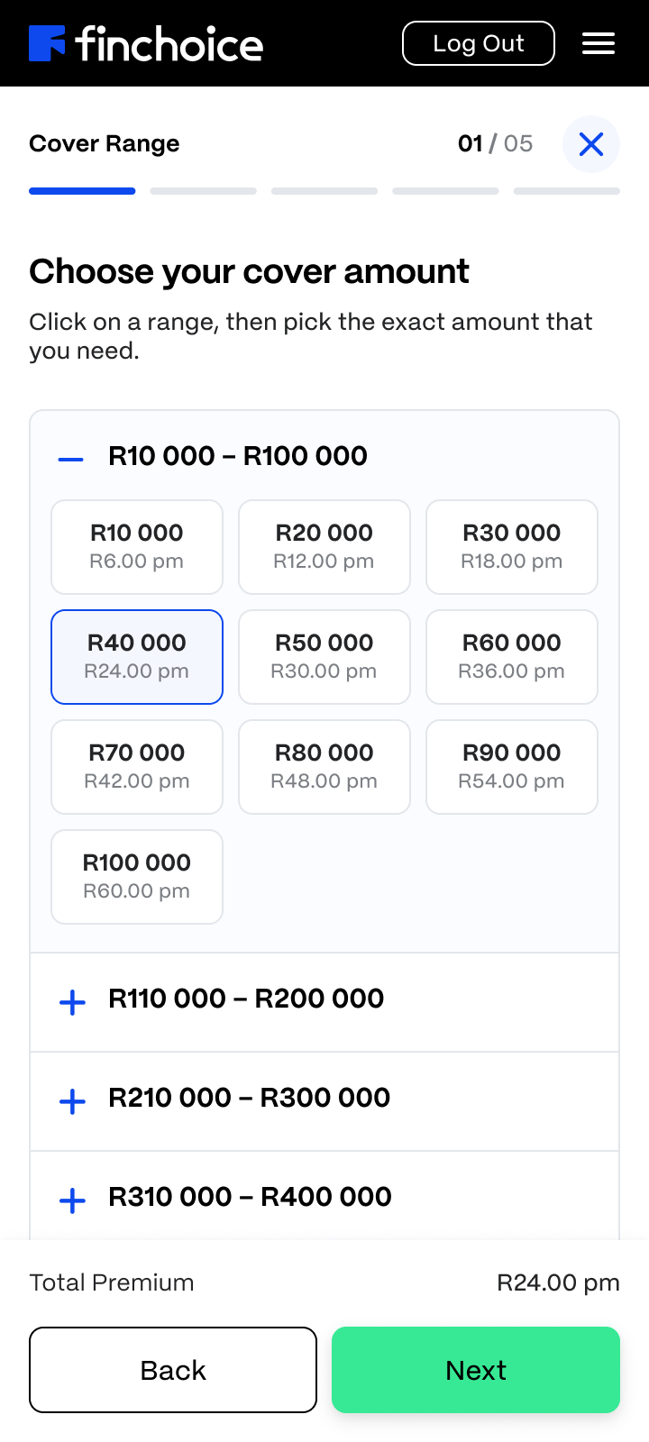
• Cover amounts to choose from varied in R10 000 increments from R10 000-R500 000. It was a challenge working alongside product owners and stakeholders to find a suitable way to achieve this as previous attempts did not work (such as a slider). It was proposed to create a tabulated design with collapsable sections where the specific cover amount could be chosen.
•A much more comprehensive and elaborate policy summary page. Initially it just summarised the policy information but the improved design gave users an opportunity to make edits, and even come back and add family at a later stage. Along with a specialised card design, later added as a new component in the component library, to grab attention and stand out to the user to gentle encourage them to come back and add dependants.

Navigation through the process
• A concern for users was not knowing where they were in the process, or what to expect when in either of the two flows. It was important to ensure users knew what to expect. A stepper was introduced during this flow, one that was different to the previous flow, breaking the process of building cover up into distinct steps to keep users informed and in control.
•I also noted that the initial design required users to complete the entire flow before exiting of they would lose their progress. I felt this could have also contributed to the drop-off, as users might not always have time to complete both flows in one go due to time, needing information etc. I proposed an option to allow users to save their progress and come back to the flow without needing to call in to the call center.
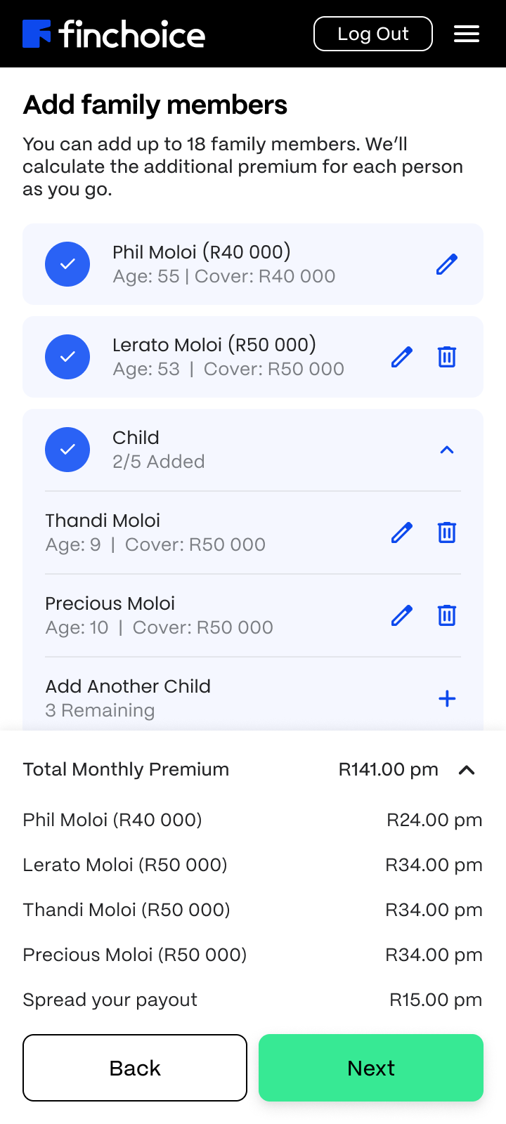
• An expandable counter was added to the bottom navigation, so that if a user added add-ons or dependant(s) to their cover there was a running counter of their total monthly premium available to them before getting to the policy summary.
• An accordion-style interaction was incorporated into the family summary in an instance where a user might have added multiple children to avoid having to scroll down a long screen. They could expand and collapse that view and see a summary of the number of dependants.