The Vineyard Website
A historical hotel in the heart of Cape Town, with elegance and charm, I assisted with enhancing the digital experience of the website. The hotel has been ever-evolving and awing its guests over the years, and it was time that the digital experience reflected that sense of playfulness and wonder.
Project Overview
Date
2025-2026
Location
South Africa
Services
UX Research & Audit • UX/UI Design • Custom Illustrations
My Approach
The Vineyard Hotel was a website project that I was initially involved in during the UI design phase for the MVP phase of the project. Along with the design of custom illustrations for their website and company branding. Once the site was live, after about a year I was brought back onto the project to spearhead the UX audit and design of the new site, and propose both UX and UI design updates. The focus of this case study will be on the UX audit as well as the UX and UI design updates made for phase two of the project.
Challenge
The Vineyard Hotel website was completed and went live in 2025. After about a year, the site was looked at again from the perspective of improving the UX of the website. With an emphasis on looking at the accessibility of the website and making both UX and UI improvements.
Solution
The process began with a UX audit of the new website, looking at the site overall but also individual components across various pages of the site. Once sufficient information had been gathered, we worked closely with the client on their analytics gathered from the website since it went live, as well as with their SEO specialist to look for areas for improvement. The final result was amendments to navigation, colour-contrast adjustments across various components and UX writing updates to improve the overall experience for users.
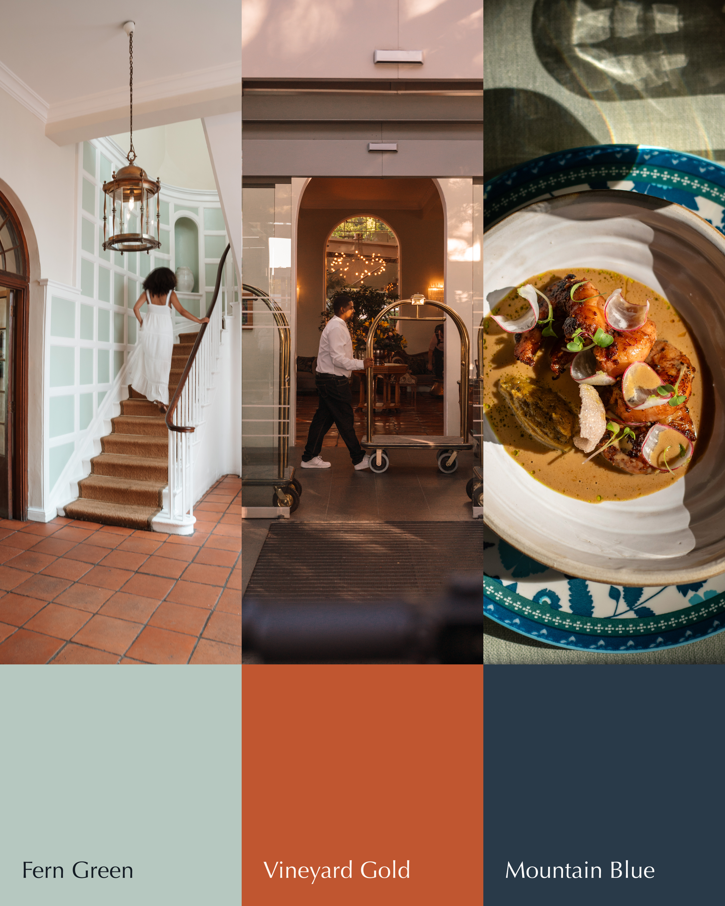
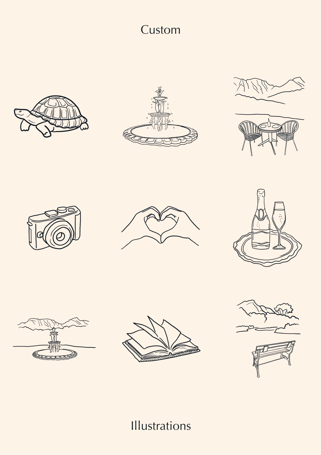
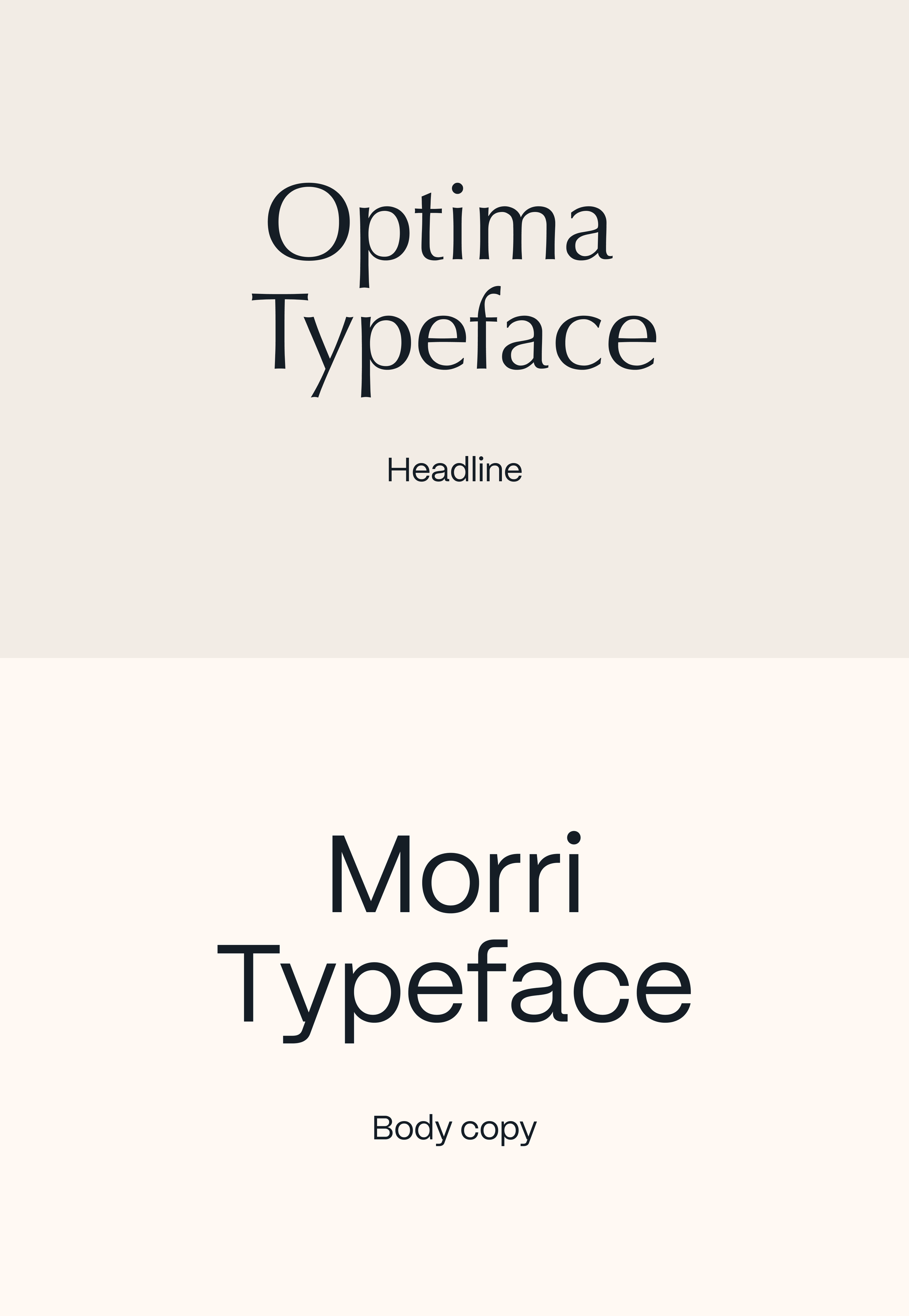
There was a lot of work put into the MVP phase of the Vineyard hotel, specifically UI and branding updates. I worked closely with the client on the new brand elements such as typography, colours and a custom set of illustrations for their website USPs. We wanted to capture the richness and vibrant essence of the history of the hotel, which has been around for many years.
UX audit and improvements
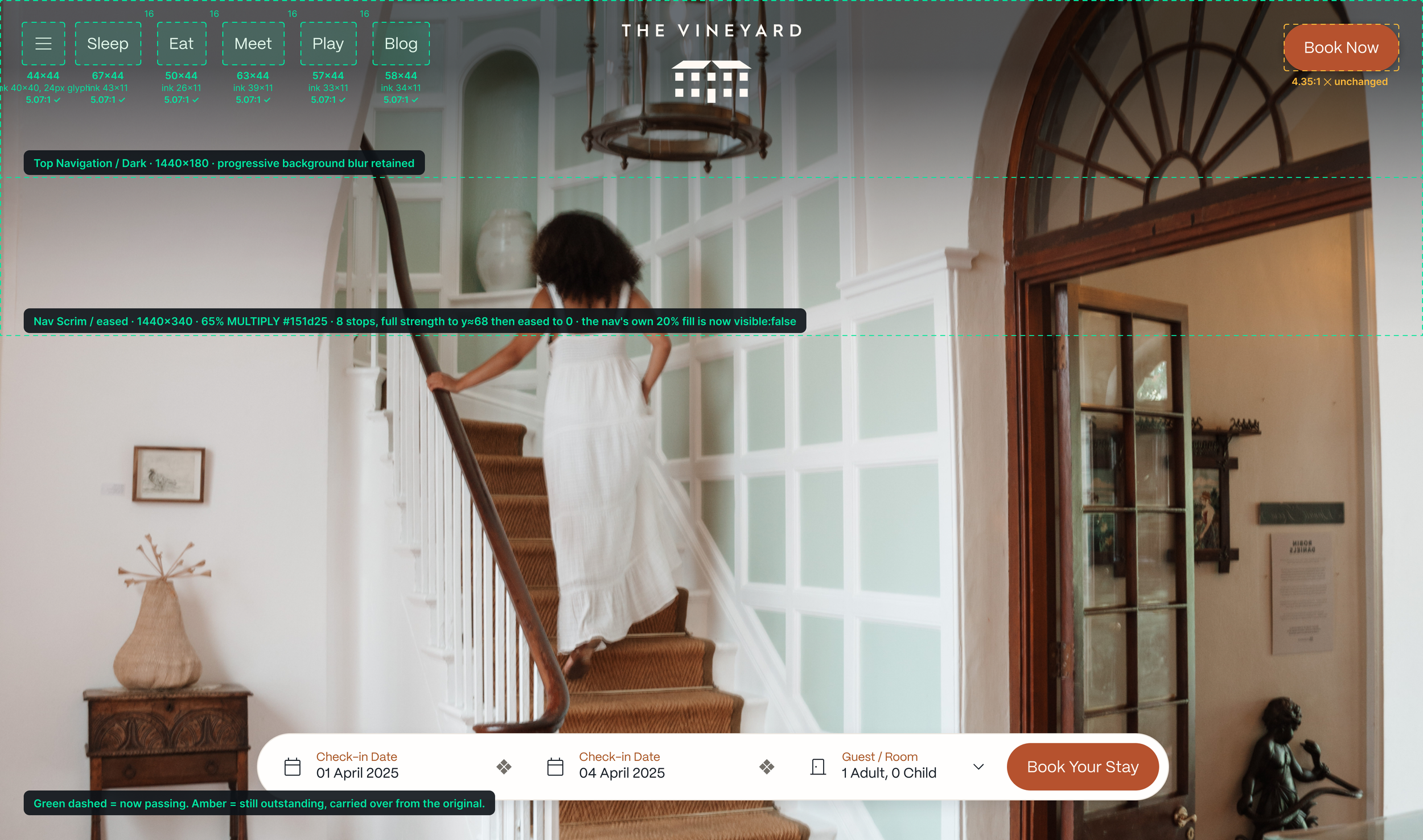
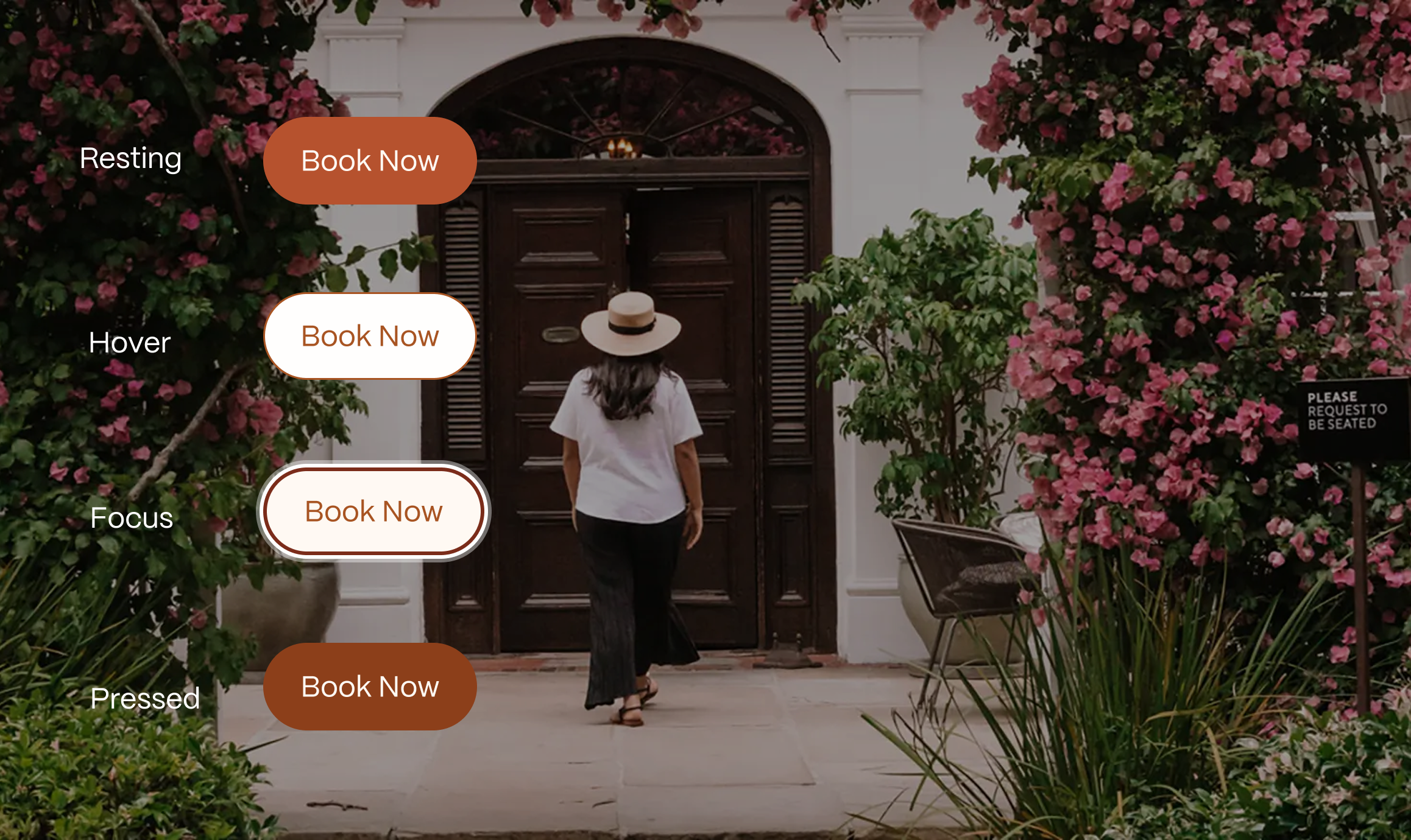
An in-depth audit was done, looking into the user experience of the current MVP version of the website, as part of V2. A key area that the client wanted to look at was the improvement of the top navigation and header of the main pages across the site. Updates to the top nav in terms of touch-target accessibility for both desktop and mobile, as well as colour contrast of the various button states. We also enhanced the legibility of the top navigation by making adjustments to the skrim.
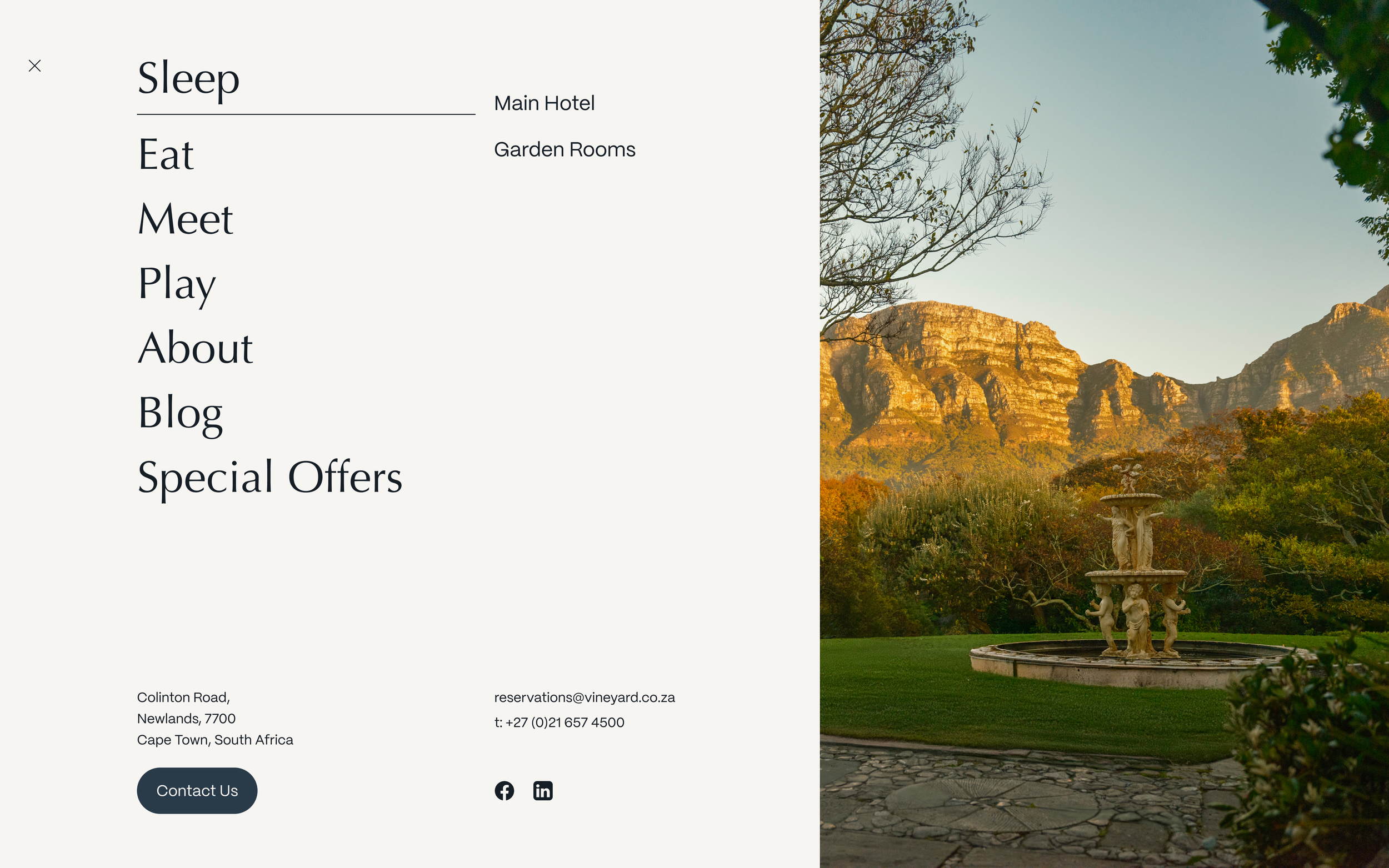
Additional feedback from the clients showed that while a burger menu was part of the top navigation for mobile, their users wanted it to be incorporated into the desktop navigation as well. This came with a layout adjustment, and design for the expanded burger menu.
Enhancing the booking experience
The booking drawer, specifically for Sleep, needed UX enhancements. An in-depth look was done into increasing padding between touch-targets, increasing the side of touch targets and creating an alternative layout where users could seamlessly add multiple rooms for multiple adults and/or children. The booking is then done through an external booking engine, pending availability. So the messaging about that also needed to be tweaked. It was previously “Book Now” but “Check Availability” ensured users know what came next in the flow.
Amended states across the component library
While the brand colours remained the same, there was a lot of research and work done into the various states of a lot of the main components across the website. Specifically looking at the contrast and difference between the hover and focus states to make them more accessible for users. The UX writing for components in an error state needed to be improved on as well, and looking at messaging for certain buttons to ensure users knew what action they were performing.